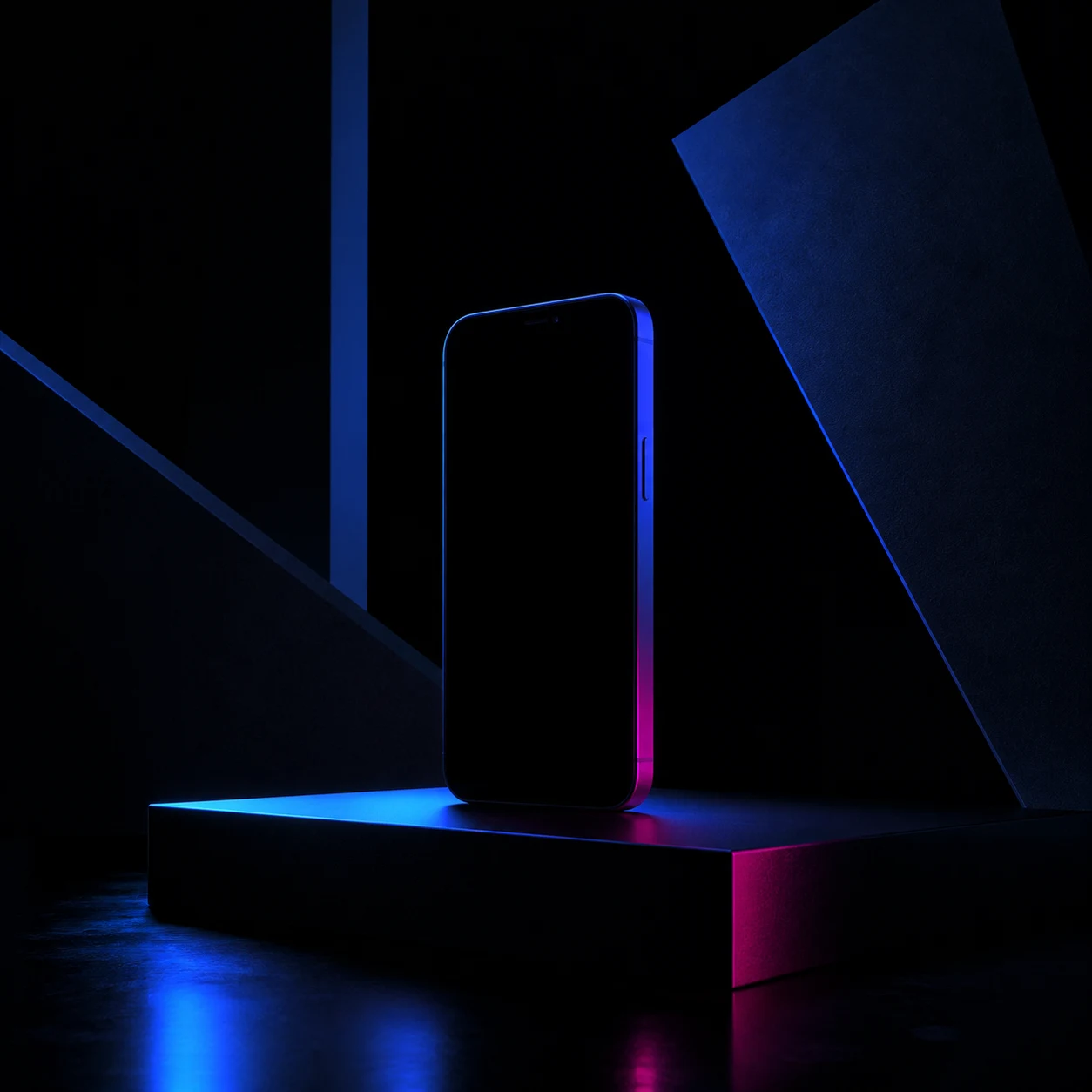
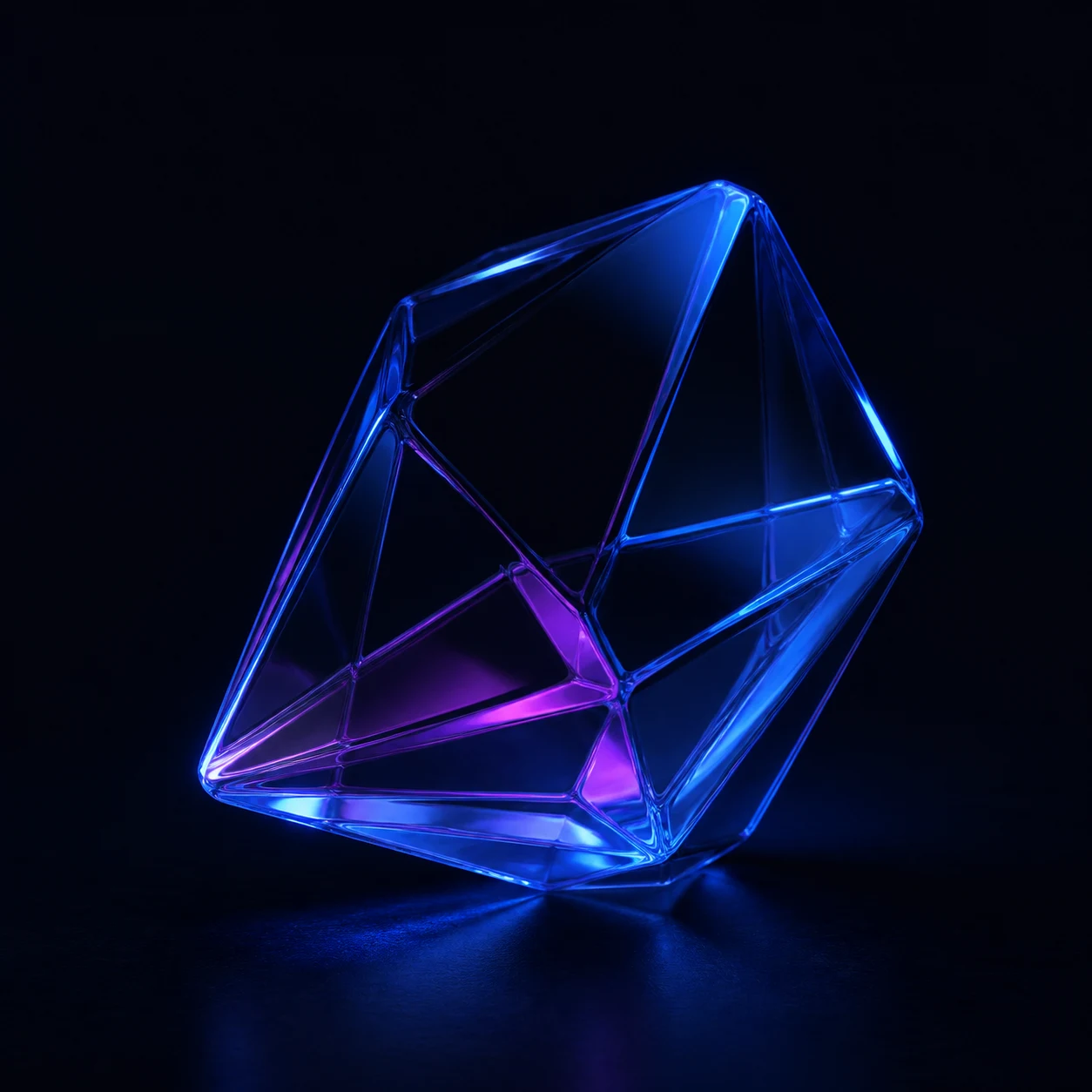
Obsidian
#05070CBlink / brand guide
A small system for making things feel related.
Dark, bright, a little strange, and still easy to use. This page is the practical reference for loke.dev and the places around it.
The mark
Two loops. One small spark.
The Blink mark is for tight spaces. Keep it on a dark field, give it air, and do not stretch it.
Download the SVG ↓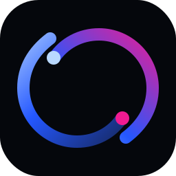
Colour
Mostly dark. Blue does the work.
Night
#0A1020Cream
#F2EEE6Ultramarine
#2457FFHot magenta
#F11B91Favicon explorations
Small enough to ship. Strange enough to remember.
Explorations only. The current favicon stays active until one of these directions wins.
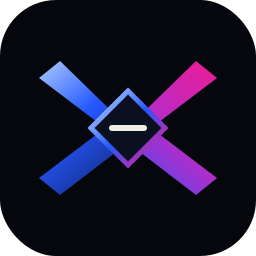
Prism knot
A folded X-like knot that keeps the Blink crossing, but gives it a sharper silhouette.
Download SVG ↓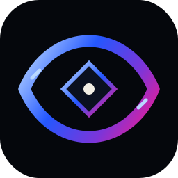
Eye loop
A small eye-shaped loop with a spark in the middle. More human, still technical.
Download SVG ↓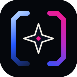
Beacon frame
A broken frame that makes the center feel lit. Distinctive in an app grid or browser tab.
Download SVG ↓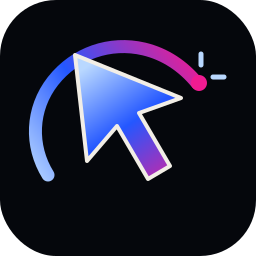
Cursor flare
A maker/developer cue: a sharp cursor shape cutting through a colored path.
Download SVG ↓Type and voice
Big, plain, and a little odd.
Software should feel obvious.
Write like a person. Keep sentences short. Say what happened, what worked and what did not. No hype, no fake urgency, no em dashes.
Social and profile assets
Ready to grab and use.

Blink avatar
Square portrait with a quiet Blink field for X, LinkedIn and other circular profile crops.
Download ↓
Story / post field
A tall, low-contrast background for stories, portrait posts and updates with room for your own copy.
Download ↓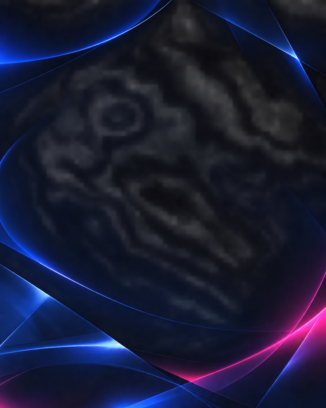


Project image set
Three visual anchors for the homepage.